TransUnion CIBIL (Mobile application)
Summary
Looking for a loan? Check your CIBIL score on our upgraded application. - Yes, we’ve revamped the app, and my role in the team was to take ownership of improving the user experience and making the application more accessible. I also conducted usability testing and contributed to setting up the visual language. - Additionally, we suggested and added features like the Credit reminders, score simulators etc to increase user engagement and provide a more personalised touch.
It all starts with a meeting. We connect with the client to understand the current state of the application, exploring why it’s designed the way it is. We focus on identifying the constraints—whether technical, marketing-related, or due to RBI rules—that have shaped its development.

Building Momentum: Kicking Off with Onboarding!
Since there are many screens to revamp, we’ve divided the process into two phases, with each phase covering 4 to 6 user flows. Each flow follows a three-step progression to reach the final wireframe: secondary research, flow chart, low-fidelity wireframe, and finally, high-fidelity wireframe. Simultaneously, we’ve initiated the setup of the design system, ensuring that once we get approval on the UX screens, we can immediately start working on the final designs. After each phase, we’ll conduct usability testing and make improvements based on the insights gathered.
We’re kicking off with the onboarding flow, the first key area for revamp. The main goal is to streamline the user onboarding experience, simplifying the process. Currently, users face too many fields to fill out and numerous verification steps, creating friction. By redesigning this flow, we aim to make it smoother and more intuitive, ensuring users can get started quickly and effortlessly.
We began with secondary research, exploring case studies and guidelines to ensure we didn’t overlook any key points. Additionally, we conducted benchmarking against both direct and indirect competitors, helping us identify best practices and opportunities for improvement.

We proposed two streamlined login flows: the first was Username + Biometrics + MPIN, and the second was Username + Biometrics + Mobile OTP. After assessing the technical constraints, the client selected the second option—Username + Biometrics + Mobile OTP—as the ideal solution.

Organising information in the right sequence is crucial to ensure users receive it at the right moment or when they need it. To achieve this, we did an information architecture that arranges everything in the proper order for seamless experience.

Through out the UX process the experience and flow gets improve drasteclity when we started design the wireframe we have improved the flows as well as information we have divided all the fields in four category. Once all information and content get organised we have stared making the high-fidelity wireframe.

Visual Design
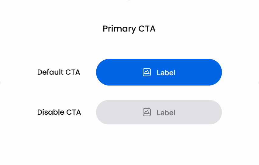
With the UX process complete and content finalised, we dove into building the visual components at the atomic, molecular, and organism levels. Our focus was on crafting elements that not only aligned with current design trends but also seamlessly integrated into a cohesive system, enhancing both visual appeal and functionality.

Final Outcome
Once all the basic components were aligned, we transitioned to crafting the final visual screens and seamlessly handed them over for development.

Prototyping is the ultimate way to bring designs to life! We created animations to ensure developers, managers, and other stakeholders can easily understand the interactions and visualize the user experience seamlessly.

After finalising all the screens, we conducted usability testing to identify and address user pain points. Be sure to check out the process and outcomes of this testing in our next project!