FinHub CX Ledger
Summary
At Datanova, I led the team in transforming the user flow, experience, and design language of the FinHub CX Ledger, a cutting-edge money management platform. This revolutionary product empowers bank operations to track transfers and helps CEO and CFO-level leaders make strategic decisions. As the first digital banking solution supporting multi-currency transfers and multi-level hierarchies, it’s designed for digital wallets, and Banking-as-a-Service, simplifying financial management across diverse platforms.
After completing the Discovery Session, we identify numerous problem areas and establish a streamlined design process to effectively utilize resources. This ensures a comprehensive and efficient product revamp, addressing key challenges with precision and clarity.
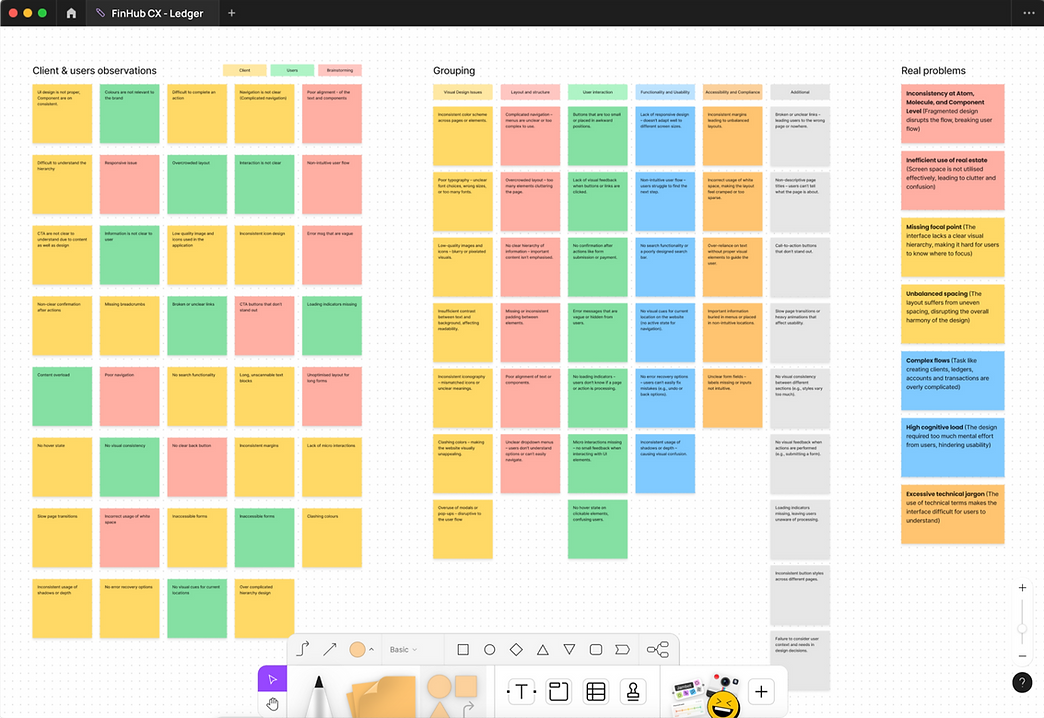
Time to identify key problems!
Each client identifies their core design issues, but we dig deeper. Through product exploration, secondary research, and user engagement, we uncover the true challenges, ensuring more impactful and effective solutions.
-
Inconsistency at Atom, Molecule, and Component Level (Fragmented design disrupts the flow, breaking user flow)
-
Missing focal point (The interface lacks a clear visual hierarchy, making it hard for users to know where to focus)
-
Unbalanced spacing (The layout suffers from uneven spacing, disrupting the overall harmony of the design)
-
Inefficient use of real estate (Screen space is not utilised effectively, leading to clutter and confusion)
-
Complex flows (Task like creating clients, ledgers, accounts and transactions are overly complicated)
-
High cognitive load (The design required too much mental effort from users, hindering usability)
-
Excessive technical jargon (The use of technical terms makes the interface difficult for users to understand)

Figure 1: Older version of dashboard

Figure 2: Older version of client screen
The journey to achieving the final outcome!
Dive into Discovery
Begin with a discovery session to gain a deep understanding of the product and its core values.
Uncover Insights
Engage in thoughtful analysis by identifying the real problems at hand. Conduct secondary research and develop user personas to guide your understanding
Prioritise Effectively
Assess and priorities the issues you’ve identified, focusing on what will drive the most impact.
Execute with Precision
Revamp the user flow and design language, followed by creating wireframes and polished UI screens that reflect your vision.
Align with Development
Conduct a thorough review to ensure that the development screens align perfectly with the final designs, maintaining coherence throughout the process.
Let’s Get Started and Stay Connected!
The day starts with a sync-up call with the team and stakeholders to ensure expectations and deliverables are aligned. We review progress, address challenges, and document all feedback and tasks, keeping everything organised, on record, and transparent for seamless project execution and communication.


Identify the real problems and set priority
Clients often present a myriad of problems, often clouded by hypothetical scenarios and personal biases. Our approach is to cut through this noise and identify the core issues. Through collaborative brainstorming sessions, we refine the real problems and prioritise them according to the product’s workflow. Once we have a clear understanding of the priorities, we get to work—implementing solutions that address the root causes and elevate the overall user experience.
We engage continuously with users across all levels—from bank operations to CFOs and CDOs. Bank operations teams utilise the platform for transaction management and client approvals, while executives rely on detailed reports for informed decision-making. This constant communication ensures our platform meets the unique needs of every user.
Let’s dive into design
It all starts with a strong foundation. We kick things off by creating low-fidelity and high-fidelity wireframes, gathering continuous feedback from stakeholders and users at every stage. We also collaborate closely with developers, ensuring the designs are not only user-centric and compelling but also technically feasible for backend implementation. This way, every flow we create is both user-friendly and developer-ready.

Design tools
We've established the Ledger Design System, crafting a comprehensive set of design components that empower designers to effortlessly build UI screens. This system ensures a consistent look and feel across all screens, eliminating visual inconsistencies and creating a seamless user experience.

Component interaction
It's crucial to see how each component animates when its style and variants changes. To make this clear, we created a prototype that helps developers understand the feasibility and provides clarity for project managers to give their final approvals.

Visual Design
Creating a modern and unique visual language was a top priority for our design team, utilising the defined components of the design system we developed. This involved establishing a cohesive color palette, UI foundations (such as shadows), and core elements. The system became integral to our workflow and consistently elevated the user interface. Feedback was validating—'the UI' frequently emerged as a key factor in Datanova securing enterprise deals. The seamless, visually striking designs were more than aesthetics—they drove business results.

Final Touch
Creating components alone isn’t enough; the real challenge begins when we start building the final screens. As we integrated predefined components from the design system, we quickly realised that adjustments were needed to enhance functionality. This led us to continually refine the design system, as we discovered that it’s an ongoing process—never truly 'finished' in one go. While making updates, we remained committed to sticking with the existing components as much as possible, ensuring consistency while adapting to new insights and needs.

The above screen contains the topmost layer of the vault hierarchy, which was created by senior managers at the CFO and CXO levels of the company and will be formally approved by the bank. Each section includes four different types of subscriptions (event types) to offer a flexible structure.


The next level is the ledger screen. Each ledger has a physical account number and can be in different states, such as Active, Inactive, or Pending. It displays two types of balances: actual balance and notional balance. For security reasons, the balance is not shown upfront; users must hover over the balance and click the eye icon to reveal it.


Below the ledger, there will be multiple and “n” level of sub-accounts, and each account will have only virtual accounts number. These accounts display four types of balances: actual balance, notional balance, ledger balance, and ledger notional balance. These balances are important to ensure the accuracy of the balance count within the hierarchy.


The above is a create transaction flow. There are two types of payments: the first is an intra-ledger flow, which occurs within the parties and requires only a virtual account number; the second is an outward payment, which requires additional beneficiary details.
In the same way, there is a create party, ledger, and account flow, which is approved by the bank operations team.